Wednesday, December 9, 2015

H


I was talking to a friend a couple of weeks ago and somehow we got on the subject of blogging and I mentioned I had this blog that I have been neglecting for several months now.  I promised to post a new entry and now it's two weeks later and I still haven't updated it yet! This post is for my friend Cre who I want to thank for motivating me to update the blog.  

I joined a Tool swap a few months back in which we had to create a card based on any Tool song.  Due to the nature of their music this was an adults only swap.  I had this image set aside for quite a while and really wanted to carve it; but, I had not found the right swap for this image until the this particular swap was listed.  

The card is based on the song H.  While the singer has said this song is actually about having children...given the title and the lyrics many people interpret it to be about heroin and addiction which fits perfectly with my image. The card has three layers to it.  The outer layer is plain black card stock.  For the second layer I sprayed white card stock with Dylusions ink and used a stencil along with Tim Holtz Distress Inks and a blending tool to lay the purple design down over the green ink.  The final layer is the stamp itself.  There is a lot of negative space in this image, so I was careful to use a new ink pad to ensure I got the best prints.  I selectively colored the syringes with a Copic marker in a contrasting color so they would pop.  I loved the way this card turned out in the end; but, it's kind of a tricky card to trade as not everybody would appreciate a dark LTC themed on addiction.  I have seven copies of this card left, so if you want to trade AQ mail me! 

Wednesday, February 18, 2015

Winters Bone


When I found this image I instantly fell in love with it; but, I also found it intimidating to carve.  To be honest I was not entirely sure I could pull it off.  I decided to go for it anyway.  I did miss some of the details; but, overall I was able to get enough detail into the stamp to render a likeness close enough to the original image to satisfy me.

The swap I used this for was a challenge to really make a card that was all about the stamp, so embellishments had to be to a minumim at most.  I used a Tim Holtz distress stain to color the paper and stamped my image on top.  After that I used a Tim Holtz distress ink in a green shade to blend the edges of the image  and sort of color in the trees.  For the last step I used a black sharpie to line the edges of the card and create a frame for the image.  My only regret with this card is that I did not use a new or newly reinked ink pad to stamp my image.  

Monday, February 16, 2015

Mother of Exiles


When a swap was listed challenging the card maker to make a card with two stamps I knew immediately what I wanted to do.  One of my favorite poems is "The New Colossus" by Emma Lazarus. It emptiomizes the plight of the infamous immigrants who came to the United States in search of a new life in a new land durning a period of time where the U.S. was coming to be the great country she is today.  Many of my ancestors were among these people and I am proud to say the Unites States provided a new life to many branches of family and allowed us to realize dreams they were all but impossible in our birth countries. 

For this card I used Tim Holtz distress inks to create the background with some flicks of water added for effect. The weeping Statue of Liberty was then stamped in Rusty Hinge distress ink and the lines from the poem were stamped on top in Versafine ink.  This will always be one of my favorite cards because it hits home with me on so many levels.  

No matter where you live, I would like to encourage you to research your family history through oral family history and written records.  The story of where you came from is precious and fascinating and you should know that story so you can pass it on to the younger generations. 

Thursday, February 12, 2015

The Velveteen Rabbit


When I joined a story book swap I knew right away that I wanted to pay homage to one of my favorite childhood stories, The Velveteen Rabbit.  It took me a while to find an image that I could carve for this one and I was nervous about carving the words as that has never been a strong point for me in carving; but, I figured the only way to get better at something is to work at it.  Since challenging myself in carving was the focus I decided to carve a quote from the book for the back of this card.  It is a bit rough in places; but, I was still pretty happy with the end result.

For the front of the card I stamped the image on white card stock using brown versa fine ink.  Next, I cut out the rabbit so I could use it as a mask.  I placed the cut out over the stamped image and used a blending tool to blend Tim Holtz distress inks over the top and bottom of the card (in blue and green shades) to bring the stamped illustration to life.  Finally I picked a bitter sweet chocolate colored card stock to use as a frame and glued the layers together.  I stamped the back of the card with the story book quote on a patterned paper that coordinated well with the front of the card.  

If you have never read this story I highly reccomend you hightail it to your local library or bookstore and enjoy this little treasure.  It's such a precious story and it always resonated with me in a very real way.  There is something so intriguing about toys coming to life and a secret world that adults can not experience that opened my mind to a world of possibilities as a child. 


Monday, February 2, 2015

Spotlight on Musicpals


Musicpals created a really great card for a Tim Holtz swap that I really loved.  As soon as I saw this card I knew I just had to Spotlight it.  The base of the card was made using Tim Holtz alcohol inks on glossy card stock.  Next, a rubber stamp of music notes was stamped on top to create a lovey custom made paper.  Finally a hand carved piano stamp was stamped onto the custom paper to create a very moving card entitled "Music Frenzy".  

Musicpals is a music teacher and musician by trade; however, that craft has left little time to develop other artistic talents, so when she discovered letterboxing it was a match made in heaven!  Having another creative outlet to develop and fine tune can be incredibly rewarding and Debbie has really brought her talents to the table with letterbox trading cards.  In recent months she has been focusing on the multi media aspect of card making and while she feels like she still has a lot to learn, I have to admit I really look forward to her cards because they are so well composed!  Her compostion skills are clearly not limited to just music!  

Sunday, January 25, 2015

Spotlight on The Mighty Oaks of Barlow


I instantly loved this card when I got it.  The Mighty Oaks of Barlow created it for a mixed media swap and I think she did a fantastic job.  The front of the card features a cut out image of dog's face which on its own would not be immediately eye catching; but, when layered over a patterned paper and given dimension with a fabric bow and foam glasses with tinted lenses this dog becomes a real person of interest on this card!  

The back of the card is a real treat too!  A Gelli Plate was used along with stencils to make a really cool mono print.  The red and blue colors you see are actually paint which was mono printed onto the paper for a really artistic effect.  I have to admit seeing this card really made me want to purchase a Gelli Plate and do some experiments of my own.

The Mighty Oaks of Barlow started letterboxing when a friend introduced her to the hobby.  She was instantly captivated by the combination of hiking, clue solving and artistry.  MOB soon introduced Wildflower Meadow to the hobby and starred hosting events as well. A fellow boxer by the name of Mumble met MOB at a few events and introduced her to LTC's.  Frykitty helped fuel this aspect of the hobby with some shared tips and tricks and a LTC maker was born!  I really love MOB's cards and am so glad she enjoys making them.  It's so fun to see each persons individual artistic style and learn from their contributions to the hobby. 

Friday, January 23, 2015

Sea Foam Dreams


I really enjoy challenging myself when it comes to making LTC's; but, I often have to back myself into a corner in order to do so.  The best way for me to do that is to list a swap with special instructions to try a new technique or a special set of guidelines in order to push myself and the participants artistically.  I really enjoy working in layers of paper and making my own paper designs starting with plain white paper, so I listed a "White No White Layers" swap where the challenge would be to make a card with at least three layers of paper.  Each layer of paper had to start out as plain white paper and needed to be custom designed so that no white would be showing in the final design.  Sounds easy enough right?  Um, it turns out to be not so easy!  White is a hard color to eliminate completely and I seriously wished I could drop this swap; but, it was my own swap, so I had to power through my frustration and make my card no matter how hard it was. Luckily in the end I was able to design a card that I loved.  Thankfully it was a really small swap because it was a lot of work to make each card.  I never could have pulled this off for a larger swap.  

The brown layer was made by spraying Dylusions ink spray in Melted Chocolate. Next I used a Tim Holtz distress ink in Walnut Stain and a mini blending tool to go over the dried Dylusions spray.  This gave me a really nice kind of bitter sweet chocolate color to use as a frame for my card (mixing the Dylusions ink sprays with Tim Holtz Distress inks is a fantastic way to make custom colors and get more mileage out of your products).

For the blue layer I actually stamped the entire mermaid stamp onto white paper and then I used a Tim Holtz Distress Ink in Peacock Feathers with a mini blending tool to color the whole paper.  To highlight the bubbles I used a darker shade of blue Stickles glitter glue to color in each one.  The difference in shades of blue really provided a nice contrast.  

The last layer was made by stamping my entire image onto white card stock and then I fussy cut the mermaid out.  This took quite a long time as the mermaid had a lot of little edges that needed to be trimmed very carefully.  I used a mix of Copic makers and Tim Holtz Distress markers to color my stamped image in.  To add a little more interest and dimension to the stamp I colored over the pink shells with a Clear Stardust Gelly Roll pen and I dotted the strands of pearls in her hair with gold Ranger Liquid Pearls.  

I carefully aligned the colored mermaid cut out over the double stamped image on the blue layer and glued it down with a glue stick.  Next, I glued those layers to the custom designed brown layer and a card was born!  


Sunday, January 18, 2015

What Key? An Alice In Wonderland LTC


I absolutely love Alice in Wonderland and was thrilled when a last minute spot opened up in this swap.  With little time to carve a stamp and create a card I decided to look for really cool rubber stamp images and find one I could carve.  When I found the image of Alice reaching up for a key it looked really unique, so I decided to try carving it.  It's not a huge stamp; but, it took FOREVER to carve due to all the little cuts that had to be made.  I also had to find the image of a keyhole and key to go with the Alice stamp; but, they were pretty easy to find and carve.  

For the outer layer I used black paper and coated it with Tim Holts Black Soot Crackle paint for a cool textured effect.  For the inner layer of paper, I covered the paper in two different Tim Holtz distress stains (broken china and peackock feathers) and then I sprayed it with Dylusions spray ink in White Linen to tone it down a bit.  Next I stamped a really cool damask type rubber stamp on top in black to make a really cool custom made background paper.  

I very carefully cut Alice out (omg this took eons to do for the whole set of cards) and colored her in with Tim Holtz distress markers.  For the keyhole I used a blending tool and some Tim Holtz distress ink in Victorian Velvet to to color the paper and cut that out as well.  I glued both Alice and the key hole down with a glue stick and used the key stamp for the back of the card.  

This was a very time consuming card to make for a last minute sign up.  I loved the way it turned out in the end though so it was totally worth the effort.  

Friday, January 16, 2015

Firefly


I joined a Wendonverse tracker hosted by Aiphid simply because I saw the list of participants and could not resist a swap with such awesome card makers.  For this swap you had to make a card based on the work of Joss Whendon.  He has done a lot of work that has rendered a cult like following; but, there was nothing I was taken with or all that familiar with.  

At first I decided to do a Toy Story card; however, I found one of his TV shows on Netflix and decided to check it out.  From that moment on o became an official Firefly fangirl.  I was devastated to realize this incredibly awesome show only lasted one measly season.  Seriously how does this stuff happen in TV land???

I quickly abandoned my Toy Story idea in favor of a Firefly card.  Once I had my stamps carved I set out to may my LTC's.  I struggled quite a bit making this card.  I kept wanting to color it in fully;  but, I hated the way it looked. After trying several ideas, I decided to phone a friend for help.  I got a few suggestions and played around with the card some more and came up with the final version in the pictures.  I used a little bit of a Tim Holtz distress ink and a blending tool to add a slightly more distressed look to the patterned paper and I used one his his distress makers to highlight some of the words.  Add a couple of gears and another patterned paper to frame the cards and you have a LTC!  

Thursday, January 15, 2015

Funny Story


I joined a swap where we had to create a card based on a funny story.  It turned out to be a really fun swap filled with all kinds of stories that made me laugh.  

Here is the story behind this card...

Once upon a time, not so very long ago (August 2014), Sharkboy returned from summer vacation with his dad's family with a collection of bags that needed to be unpacked. If I don't unpack bags right away I don't unpack them for at least six months, so I have learned the hard way that I must unpack all bags immediately for the sake of my sanity and good housekeeping. I very quickly enlisted Sharbkoys help with this task and in no time at all I was holding up one item after another asking "Clean or not clean?". He begrudgingly obliged me; but, when we got to a swimsuit he started to say "Not clean"...then he stopped himself mid sentence and said very matter of factly"Oh, it doesn't matter because that is a bathing suit." ME: *sputtering* *disbelief* *was this child raised with wolves on a surrogate planet*. "Um, it absolutely DOES matter!!!!!!" Dead serious he ignores my blatant display of horror and disbelief and says "No, you don't need to wash them because they go in the water." *SIGH*... We had a very serious talk about why Swim suits need to vow washed after each wear which included eye rolling and some not very well thought out arguments on his behalf. The end verdict was swimsuits DO get washed! I love this story; but, in order to make a not sucky card, I had to find something cool to carve and then it hit me, one of my most favorite albums from high school was Sonic Youth's Washing Machine album. I very happily based my card on that and was pretty happy with how it came out even though it is a pretty basic card. :) 

Saturday, December 20, 2014

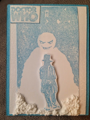
Dr Who Villians


As a newly converted Whovian I was super excited to join a Dr Who Villians swap even though I am just learning who the Villians are.  I ended up making two cards for this swap because I was not happy with my first card.  I actually almost threw out my first set of cards; but, I'm glad I didn't because a lot of people enjoyed them which truly shows that art is subjective.  

The second card I made was called "Limited Edition Cyberman".  I really loved this card.  I used one blend of blue, yellow and silver alcohol inks for the cyberman and cut him out.  For the base layer I used another blend of alcohol inks in yellow and orange and painted that layer with Tim Holtz Hard Rock Candy Crackle paint.  I glued the layers together, adding foam dots behind the Cyberman to make him pop out, then I added a black frame to finish the front of the card.  The back of the card was pretty simple with some orange patterned paper and a small Dr Who stamp. 


Now let's talk about the first card.  I absolutely loved the image when I found it and wanted to do a darker card in black and a kind of bright maroon color; but, shockingly I did not know about Versafine ink and I was not able to get crisp black images with my Ranger Archival ink, so I abandoned that idea and decided to go with cool winter colors instead.  I used a shimmery blue ink to stamp my stamp and added a cutout of Dr Who mounted on foam dots for dimension.  Snow-Tex was used to add a snow like texture to the bottom of the card and I added a double frame to the image in shiny blue and white cardstock.  
For the back I stamped an additional snowman stamp in a shimmery pink ink; but, it did not show us as well as I had hoped.  When the card was finished I knew I was not happy with it; but, I had put SO many hours into carving and making this set of cards.  For me the best solution to this problem was to consider this a bonus card for the swap and make a new card.  I'm so glad I did that!  The swap host Eyeoremama was very gracious and did not mind sorting the additional card for the swap and the other swap members were very kind when leaving their "found card" comments on both the Snowmen and the Cyberman.  


Sunday, November 30, 2014

Wildflower's- An Alice Bonus


I really love Alice in Wonderland, so when a last minute spot opened up for this swap I jumped on it.  Unfortunately the Post Office lost my return set of cards, so I decided to make a bonus Alice card for anybody who would be willing to send me a copy of their card.  

One of the tough things about doing an Alice in Wonderland card is coming up with something fresh and new.  So many of the characters and images have been done by other card makers; therefore, I really wanted to try and pick something that might not have been done before. When I found this quote from the original Disney movie, I knew it would be perfect. 

I am in so many swaps right now and am struggling to pull my cards together, so I needed a relatively easy design for this card. Ranger Alcohol inks are my secret weapon when I am short on time!  They have the ability to make any stamp come alive.  For this card I used four colors of alcohol inks that you might find in nature and I stamped my image on top.  Next, I sprayed a frame layer with Dylusions Ink Spray and glued the layers together with a glue stick.  I really liked the way this card turned out.  I did finish the back; but, due to time constraints I was not able to carve a new Alice stamp for the back.  I recycled one of my stamps from my "What Key" card. 


Monday, November 24, 2014

Delivering Justice


When I saw this image I knew I had to use it for a card, so when I saw the Seven Virtues tracker I knew I had to carve it.  I decided to call the card "Delivering Justice" as Batman is delivering his own brand of Justice to the Joker in a fierce and powerful way. 

I used Tim Holtz Distress markers and a gray Prisma marker to color this card in.  I played around with coloring it quite a bit and settled on two versions that I really liked, so I decided to do both.  The front of the card is a more bold rendition while the back of the card is more streamlined and pared down.  I covered the front of the card in mat Mod Podge which turned out to be a mistake.  Mod Podge is a water based glue and the distress markers are also water based which caused them to bleed a bit.  It did not completely ruin the card; however, it is somewhat noticable.  Lesson learned.


Sunday, November 2, 2014

In The Trenches


I created this card for a Mod swap in which you had to use Mod Podge in the construction of the card.  I have always wanted to carve an image with rain, so this was the perfect swap to carve a "rain" image.  

I used water colors to paint this image and added a black mat frame.  A Dymo label maker was used to emboss the word "Valor" on a piece of tape which was then added to the bottom of the card.  Keeping with the rules of the swap I painted the whole card in glossy Mod Podge to add that glistening rain effect to the card.

For the back of the card I layered another piece of paper and stamped the image of a soldier smoking a cigarette to tie the front and back of the card together. 

I'm not the best at watercolors as it is a relatively new technique to me; but, this card provided a great opportunity for me to practice my skills.  If there has been something you have wanted to try or get better at, I want to encourage you to go for it!  The only way to improve is through practice.  You might not be thrilled with your first few attempts; however, if you keep at it you just might master the skill and add another technique to your arsenal to create more fantastic pieces of artwork down the road. 

Thursday, October 30, 2014

Bloodless Halloween


I listed a last minute Halloween swap: Bloodless Halloween just because I desperately wanted to carve these images.  I found them on a blog called Uncle Ernie's Creature Ink.  The artwork is by Ernie Kwiat.  

I colored this image in with Tim Holz distress markers and mounted it on a mustard colored patterned paper.  After that I painted it with Ranger distress paint  in clear rock candy and finally I used mini round blending tool to blend in some black soot distress ink over the outer edges of the card.  

All in all, I was happy with how this card turned out.  I enjoyed making it so much that I made several extras and sent five copies out in Marjorie's Potpourri for October. I can't wait to see my suprise cards from that tracker!  I really love the MP trades because they are like the box of chocolates in Forest Gump. You never know what you are going to get!  Often times I get cards from swaps I wanted to join, but, was not able to so it can be a fun suprise to get those cards in this monthly swap.

Sunday, October 26, 2014

Spotlight On Badegg


Badegg created a really ingenious card for a Recycled Art swap.  When I first saw it I sat back and had a good laugh.  Two playing cards were glued together and a circle was cut out in the middle where the King's tummy would be.  A trio of hand carved eggs was then inserted between transparent sheets of paper and glued together.  You can even shake the card and watch the eggs jostle about in there.  The effect gives you the idea that the King wished he did not have eggs for breakfast!  

Badegg is a really cool individual.  She is covered in tattoos and has a particularly striking half sleeve of her cat and the cats purple castle on her arm.  She is also fluent in sign language (seriously how cool is that?!?) and loves all kinds of eggs from the pickled variety to fried.  

She was a rebellious kid which is where the fun trail name came from.  Many of her cards are tied in with the trail name which I really like.  It's kind of like having a trademark.  

I can't wait to see more fun cards from this LTC maker! 

Sunday, October 12, 2014

Harry Potter and a Hot Girl

For my Harry Potter cards I wanted to do something different.  There have been so many Harry Potter swaps and I was afraid my image may have been done before in a more traditional manner.  

I broke the alcohol inks out and decided to make this showdown between Harry and Valdemort appear like it occurred in the middle of a color run.  I used three colors of inks to make the background for this image and I also used distress inks in Orange Marmalade to make the orange mat layer.  Plain black paper was used for the outer frame and lastly I painted the entire card in Ranger Distress Crackle Paint in hard rock candy to give it a more crackly effect.  I was pretty happy with how these cards turned out and can't wait to see the rest of the cards from this swap!


A few friends talked me into signing up for the Babes tracker at the last minute, so I did not have a lot of time to pull this card together.  I needed an easy peasey carve so I could spent more time working on the card itself.  

I decided to customize my paper for this card by using distress paint in black soot for the outer frame.  The inner frame was made using salty ocean distress ink.  I used a blending tool to make the blue background and then stamped a polka dot rubber stamp on top of that in the same color to create a cool handmade background to highlight my hand carved stamp.

Next, I stamped my babe using versa fine ink and colored her dress and tattoo with a Prisma marker.  I gave her some shimmery eye shadow using a clear stardust gelly roll pen and added a fabric flower to her hair.  

For the final touch I carved the words "Hey Daddy-O!" and stamped them on some red paper, then layered them on top of the card.  

With the final touches done, my babe was ready to mail out and I was happy to check this card off of my to do list.  Producing a card in one week can be very stressful!  


Sunday, October 5, 2014

Spotlight on Team Awesome Pants

Team Awesome Pants created this card for an Idioms swap. The card is entitled "Mum's The Word".  I was immediately drawn to this card for two reasons.  First, I absolutely love stamps with a lot of negative space (meaning the part of the stamp that takes ink, or the dark part).  Even simple stamps can be very striking when they have a lot of negative space and they have the ability to make very impactful images that stick with you.

The other thing I really love about this card is the layers of paper which were very carefully picked by TAP.  She spent eons in the craft store holding up sheet after sheet of paper in all sorts of combinations before she settled on this trio.  Adding layers to frame your stamped image is truly one of the easiest yet, most striking things you can do to really make an image pop.  

The back of this card has been "finished" as well.  I'm a real sucker for cards that have a finished back.  A finished back can include anything from extra stamped images, some extra color or even an extra layer of paper.  I think it really helps to make a card extra special when the card maker takes a little bit of time to tie the back if the card in with the front.  In this case TAP added an extra layer of paper to the back using the patterned papet from the front of the card. She also hand wrote her trail name, card name, box number and date between the lines to give the card a finished look.  

I think this card is a perfect example of how to compose a great card with a simple yet striking stamp, perfectly matched paper and a well done back.  Great job Team Awesome Pants! 


Sunday, September 28, 2014

Corpse Bride LTC

I absolutely love Halloween.  It is easily my most favorite day of the year, so I was so excited when a last minute spot opened up in a Halloween swap. I did not have much time to pick a subject, carve and create a card so I decided to go with a Corpse Bride theme.  I am a huge Tim Burton fan and never get tired of carving his work.  

For this card I made a tripple layered mat and added a fourth layer of the cut out stamped image.  For the mat I used coordinating paper from a paper book.  I know those $20 books look so expensive ; but, if you use a coupon you can buy them for a decent price and to be honest the paper is usually a lot nice than the loose card stock. Also the paper almosr always coordinates well with other sheets in the book, so that helps take the guess work out of things.  

I colored parts of the stamp with Prisma, Marvey and Distress markers.  It took forever and reminded me how much I hate coloring.  Finally I cut heart shapes out with my Cricut and painted them with Black Soot Crackle paint.  Even though the card took forever to make, I wouldn't change a thing.  I'm hoping next year to get in a swap much earlier and go with a more intricate carve. Hard 

Sunday, September 21, 2014

Spotlight on The Boxing B's

This is one of the first cards I received in a small individual trade swap that I organized to get my feet wet again with making and trading cards.  I instantly loved this card when I saw it.  I love sparkly things and I especially love the monochromatic look when it is done well.

    I have passed over the sparkle cardstock at the craft stores so many times thinking there is NO WAY I could use that stuff to make a nice card; but, this card totally proves me wrong.  

"Color Wheel: Blue Fishy" was designed by trying to use as many shades of blue as possible.  The Boxing B's were looking for colors of the ocean when deciding on the cardstock, glitter embossing powders and well matched bubble stickers.  The end result was a very streamlined look with a sparkly twist.  This design would make a great greeting card!